Condividi


Il Regolamento UE 2016/679 sulla “protezione delle persone fisiche con riguardo al trattamento dei dati personali, nonché alla libera circolazione di tali dati” (di seguito “Reg. UE 2016/679” o “GDPR”) contiene una serie di norme dirette a garantire che il trattamento dei dati personali si svolga nel rispetto dei diritti e delle libertà fondamentali delle persone.
La presente informativa regolamenta le procedure seguite da Avangarde Enterprise S.r.l. in relazione al trattamento dei dati personali effettuato in qualità di Titolare del trattamento dei dati personali (per brevità, di seguito il “Titolare” o “Avangarde”) raccolti attraverso la navigazione del Sito www.avangarde.it (di seguito anche solo “Sito”) e appartenenti a tutti coloro (gli “Interessati") che interagiscono con il Sito stesso.
A seguito della consultazione di questo Sito possono essere trattati dati relativi a persone identificate o identificabili.
Ai sensi degli artt. 13 e 14 del GDPR, Avangarde Enterprise S.r.l. (C.F. e P. IVA 13868670962) – con sede legale in 20124 - Milano (MI), via Mauro Macchi, n. 8 nella persona del Legale Rappresentante pro tempore, è il Titolare del trattamento ed è tenuta a fornire informazioni riguardanti il trattamento dei dati personali degli Interessati.
I dati di contatto sono i seguenti:
Telefono: +39 0382 189 1718
E-mail: dpo@avangarde.it
Pec: avangarde.enterprise@legalmail.it
La Società ha provveduto a nominare il Responsabile della protezione dei dati personali (c.d.“DPO”) contattabile al seguente indirizzo di posta elettronica: dpo@avangarde.it
I dati personali possono essere liberamente forniti dall’Utente o, nel caso di dati di navigazione, raccolti automaticamente durante la navigazione nel Sito internet della Società.
In fase di connessione al Sito, i sistemi informatici e le procedure software preposte al loro funzionamento somministrano e/o acquisiscono automaticamente ed indirettamente alcune informazioni (i c.d. “cookie”). Il trattamento di questi dati è necessario al Titolare al fine di garantire l’esperienza di navigazione e per fornire tutte le funzioni e i servizi attraverso il Sito. Nello specifico sono presenti solo cookie tecnici di prima parte ASP.NET Authentication, utili per il login (conservati limitatamente alla durata della sessione del browser) e per l’impostazione della lingua (conservati per 2 mesi). È tuttavia possibile limitare il trattamento di tali dati personali dal proprio dispositivo o browser/applicativo di navigazione. In tale eventualità, la navigazione sul Sito potrebbe risultare limitata e alcune delle sue funzioni/servizi potrebbero essere inaccessibili.
L’interazione con Avangarde attraverso il modulo nella home prevede l’inserimento del nome, cognome e indirizzo e-mail di contatto. Ulteriori dati personali, quali titoli di studio o esperienze lavorative, potranno essere liberamente forniti nel testo del modulo per meglio specificare la richiesta di informazioni inoltrata.
Non dovranno essere indicati “l'origine razziale o etnica, le opinioni politiche, le convinzioni religiose o filosofiche, o l'appartenenza sindacale, nonché dati genetici, dati biometrici intesi a identificare in modo univoco una persona fisica, dati relativi alla salute o alla vita sessuale o all'orientamento sessuale della persona.”.
Per quanto concerne i dati particolari di lavoratori diversamente abili in applicazione della vigente normativa in materia di collocamento dei disabili, si precisa di non indicare alcuna patologia ma di indicare solamente di essere in possesso di tali requisiti.
L’interazione con Avangarde potrà avvenire, altresì, attraverso i contatti di posta elettronica e telefonici pubblicati nella sezione del sito “Contatti" (e/o nelle sezioni “Contattaci") e può comportare la raccolta e il trattamento di altri dati personali (a titolo esemplificativo, l’indirizzo e-mail ed ulteriori dati personali contenuti nel messaggio di posta elettronica o liberamente forniti telefonicamente).
Il conferimento dei dati è facoltativo, tuttavia il mancato conferimento degli stessi determinerà unicamente per il Titolare l’impossibilità di trattare i dati e conseguentemente di fornire informazioni.
L’utente potrà poi proseguire la navigazione nelle aree Lavora con noi e Area Personale.
In Lavora con noi l’utente può candidarsi alle posizioni aperte tramite apposito modulo, fornendo dati personali quali, a scopo esemplificativo e non esaustivo, nome, cognome, numero di telefono, indirizzo e-mail, titoli di studio, esperienze lavorative. Può in oltre caricare nello stesso modello il file del proprio Curriculum Vitae per facilitare la selezione e rendere maggiormente efficacie la sua candidatura. Anche in questa area si richiama all’applicazione delle attenzioni sopraindicate riguardanti i dati sensibili e lo stato di disabilità. Per permettere ad Avangarde di contattare il candidato anche per altre posizioni lavorative aperte, o che si apriranno successivamente, e per fornire il profilo ad aziende terze clienti di Avangarde che ricercano specifiche figure professionali, l’utente può acconsentire con apposito flag alla propria profilazione ad opera del personale autorizzato (processo decisionale non automatizzato) e all’invio a terzi dei dati forniti.
Il trattamento dei dati personali avverrà secondo le finalità di seguito indicate e sarà improntato ai principi di correttezza, liceità, trasparenza e di tutela della riservatezza e dei diritti dell’Interessato.
I dati raccolti saranno trattati per la seguente finalità:
La base giuridica che giustifica il trattamento è costituita:
per la finalità di cui alla lettera a. e b. per dare esecuzione ad attività di natura precontrattuale/contrattuale richieste (art. 6, par. 1, lett. b), Reg. UE 2016/679) e sulla base del consenso liberamente prestato per finalità connesse o strumentali allo svolgimento dell’attività di ricerca e selezione del personale (art.6, par. 1, lett. a);
per la finalità di cui alla lettera c., dall’adempimento di un obbligo legale al quale è soggetto il titolare del trattamento (art. 6, par. 1, lett. c), Reg. UE 2016/679).
Il conferimento dei dati, nonché la loro comunicazione alle categorie di soggetti indicate al par. 7, non è obbligatorio, ma l’eventuale rifiuto dell’Interessato di fornire i propri dati ordinari comporterà l’oggettiva impossibilità per la Società di riscontrare le richieste di contatto o di informazioni e/o di poter adempiere agli obblighi di legge.
Il trattamento dei dati personali avviene mediante strumenti manuali, informatici e telematici con logiche strettamente correlate alle finalità dichiarate nel presente documento e, comunque, in modo da garantire la sicurezza e la riservatezza dei dati stessi in conformità alle norme vigenti. In caso di trattamento effettuato con modalità di elaborazione elettronica e non e sistemi di gestione e storage anche con hardware e software all’avanguardia, Avangarde può utilizzare società di servizi terze che saranno rese edotte delle proprie responsabilità con comunicazione di nomina a Responsabile del trattamento ai sensi dell’art. 28 del GDPR. L’elenco aggiornato dei Responsabili del trattamento è custodito presso la sede legale del Titolare e accessibile su richiesta dell’interessato.
I dati raccolti verranno conservati per un arco di tempo non superiore al conseguimento delle finalità per le quali sono trattati (“principio di limitazione della conservazione”, art. 5 GDPR), fermo restando i casi di ottemperanza ad un obbligo di legge o di ordine di un’autorità. La verifica sulla obsolescenza dei dati conservati in relazione alle finalità per cui sono stati raccolti viene effettuata periodicamente. Al termine del periodo di conservazione, i dati personali saranno cancellati, distrutti o resi anonimi, fatti salvi gli eventuali termini di conservazione previsti dalla legge. Pertanto, allo spirare di tale termine il diritto di accesso, cancellazione, rettificazione ed il diritto alla portabilità dei dati non potranno più essere esercitati.
In taluni casi l’esecuzione delle attività connesse e/o strumentali alla gestione delle richieste comporta la comunicazione, da parte del Titolare, di dati personali degli Interessati a società o enti esterni. I dati personali dell’Interessato potranno essere resi accessibili per le finalità sopra descritte:
a dipendenti e collaboratori del Titolare, nella loro qualità di soggetti autorizzati al trattamento e/o sub-responsabili del trattamento e/o amministratori di sistema;
a società terze o altri soggetti (a titolo meramente indicativo e non esaustivo, la società che si occupa della gestione dei dati personali degli utenti e della gestione dei sistemi informatici sui quali essi sono memorizzati) che possono svolgere anche attività in outsourcing per conto del Titolare, nella loro qualità di Responsabili del trattamento;
i soggetti le cui facoltà di accedervi siano riconosciute da disposizioni di legge. I soggetti appartenenti alle categorie alle quali i dati possono essere comunicati effettueranno il trattamento dei dati medesimi e li utilizzeranno, a seconda dei casi, in qualità di Responsabili del trattamento espressamente nominati da parte del Titolare ai sensi di legge o, piuttosto, in qualità di autonomi Titolari.
previo consenso dell’interessato i dati saranno comunicati a società terze clienti di Avangarde che ricercano specifiche figure professionali.
I dati verranno trattati dal Titolare del trattamento nel territorio dell’Unione Europea presso la sede legale sita in 20124 - Milano (MI), via Mauro Macchi, n. 8.
I dati personali degli Interessati sono conservati su server ubicati presso la sede legale del Titolare o in cloud su server europei nel rispetto della vigente normativa e che non potranno essere trasferiti da Avangarde in Paesi extra – UE.
Qualora per questioni di natura tecnica e/o operativa si renda necessario avvalersi di soggetti ubicati al di fuori dell’Unione Europea, tali soggetti saranno nominati Responsabili del Trattamento ed il trasferimento dei dati personali a tali soggetti, limitatamente allo svolgimento di specifiche attività di Trattamento, sarà regolato in conformità a quanto previsto dal GDPR. In tal caso, il Titolare assicura sin d’ora che il trasferimento dei dati extra-UE sarà regolato in conformità a quanto previsto dal capo V del Regolamento e autorizzato in base a specifiche decisioni dell’Unione Europea.
Saranno quindi adottate tutte le cautele necessarie al fine di garantire la più totale protezione dei dati personali basando tale trasferimento:
L’Interessato ha il diritto di chiedere al Titolare del trattamento, ove possibile:
Inoltre, ha il diritto di:
Per esercitare i diritti di cui sopra l’Interessato potrà rivolgersi al Titolare del trattamento dei dati personali con una raccomandata a.r. a Avangarde Enterprise S.r.l., Via Mario Ponzio, n. 20, 27100 – Pavia (PV), ovvero una mail all’indirizzo: dpo@avangarde.it
In alternativa, l’Interessato può rivolgersi al Responsabile della protezione dei dati contattabile all’indirizzo di posta elettronica: dpo@avangarde.it
I minori di età inferiore ai 16 anni non devono conferire informazioni o dati personali alla Società in assenza del consenso delle persone autorizzate o degli esercenti la responsabilità genitoriale su di loro. In mancanza di tale consenso, non sarà possibile l’invio di richieste da parte del minore attraverso il Sito. Avangarde invita tutte le persone autorizzate e coloro che esercitano la responsabilità genitoriale su minori ad informare gli stessi sull’utilizzo sicuro e responsabile di Internet e del Web.
Il Regolamento Generale sulla Protezione dei Dati in sigla RGPD (o GDPR in inglese General Data Protection Regulation), ufficialmente regolamento (UE) n. 2016/679 , prevede la nomina del Responsabile per la Protezione dei Dati in sigla RPD (o DPO in inglese Data Protection Officer). Il RPD - DPO di Avangarde è:
Fabio Zambianchi
Le Vele Servizi Srl
P.iva: 02760560181
Email: dpo@avangarde.it
Il Titolare del Trattamento si riserva il diritto di apportare modifiche alla presente informativa in qualunque momento dandone informazione agli Utenti su questa pagina. Chiediamo, dunque, di consultare regolarmente questa pagina, prendendo come riferimento la data di ultima modifica indicata in fondo. Nel caso di mancata accettazione delle modifiche apportate alla presente Informativa, l’Utente è tenuto a comunicarlo al Titolare del Trattamento e può richiedere di rimuovere i propri dati personali. Salvo quanto diversamente specificato, la precedente Informativa continuerà ad applicarsi ai dati personali sino a quel momento raccolti.
Milano, Novembre 2025
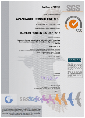
La qualità è un presupposto imprescindibile per le attività di Avangarde Group.
Per questo motivo ha deciso si sviluppare e mantenere un sistema di qualità aziendale per definire meglio le sue competenze e procedure che regolano il normale svolgimento di tutte le attività lavorative, secondo lo Standard ISO 9001.